Abishek Muthian
COVID-19 temperature correlation
A user on needgap posted a problem of not being able to find graphs showing confirmed COVID-19 cases and local weather data such as temperature.
The reason for reputed agencies not publishing such graph is likely to prevent misinformation and possibly to avoid governments getting complacent in their action towards COVID-19.
But, as an individual I thought visualising that data might be a quick, worthy data exploration exercise and useful to those who understand the involved caveats.
I'm intentionally keeping this simple to be easily reproducible by that needgap user or anyone.
Caveats
WHO has published the fact that COVID-19 virus can be transmitted in areas with hot and humid climates. Neither Cold weather and snow CANNOT kill the new coronavirus. Please follow their and your local CDC's guidelines on COVID-19 disease prevention.
The temperature data is acquired via 3rd party paid weather API, which in-turn acquire the data from various other agencies. The temperature data is likely forecasted data as acquiring recorded global temperature at hyperlocal level is very hard.
The temperature on the day when the infection is reported doesn't necessarily mean that the patient was infected on that day.
The Confirmed COVID-19 cases reported according to each country/province/state is obtained via Johns Hopkins University Center for Systems Science and Engineering published data.
NEITHER ME nor THE DATA PROVIDED IN THIS WEBSITE INSINUATE ANYTHING REGARDING COVID-19 DISEASE.
New Daily confirmed COVID-19 cases vs Local highest temperature on that day
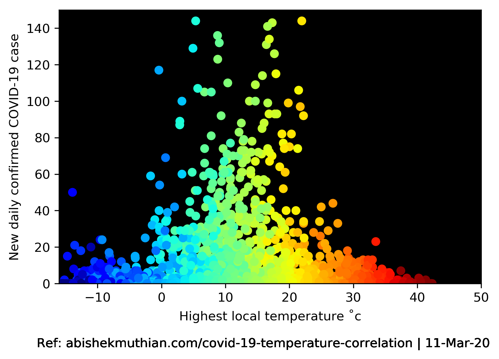
The last updated data based on which the above graph was plotted in mentioned within the image. I haven't decided on the schedule to update the graph i.e. weekly/monthly, if you find the data useful and would like it to be updated frequently do let me know.
The entire data exploration activity which lead to creation of the above graph is embedded from the GitHub gist below. I welcome corrections and suggestions to improve the accuracy or better visualisation of the data.
The jupyter notebook gist will load below (might take a while) -
Observations
As WHO has pointed out, there has been reported infections both on hot days (e.g. Australia, Thailand) and cold days (e.g. China, Alaska).
There were high number of newly reported cases from the epicenter of the COVID-19 disease - Hubei, China; as 4024 new cases on 2/2/20 alone which has been dropped to 17 new cases as of 3/10/20.
Most number of newly reported cases outside China are from Italy with an average of 207.12 cases, 153.32 cases in the Republic of Korea and 164.12 in Iran respectively from 1/22/20 to 3/10/20.
There has been an average of 7.01 newly reported infected cases from 1/22/20 to 3/10/20.
There has been an average local highest temperature of 12.61 ˚c from 1/22/20 to 3/10/20. It's worth to note that January 2020 is the hottest January ever in the recorded temperature of human history.